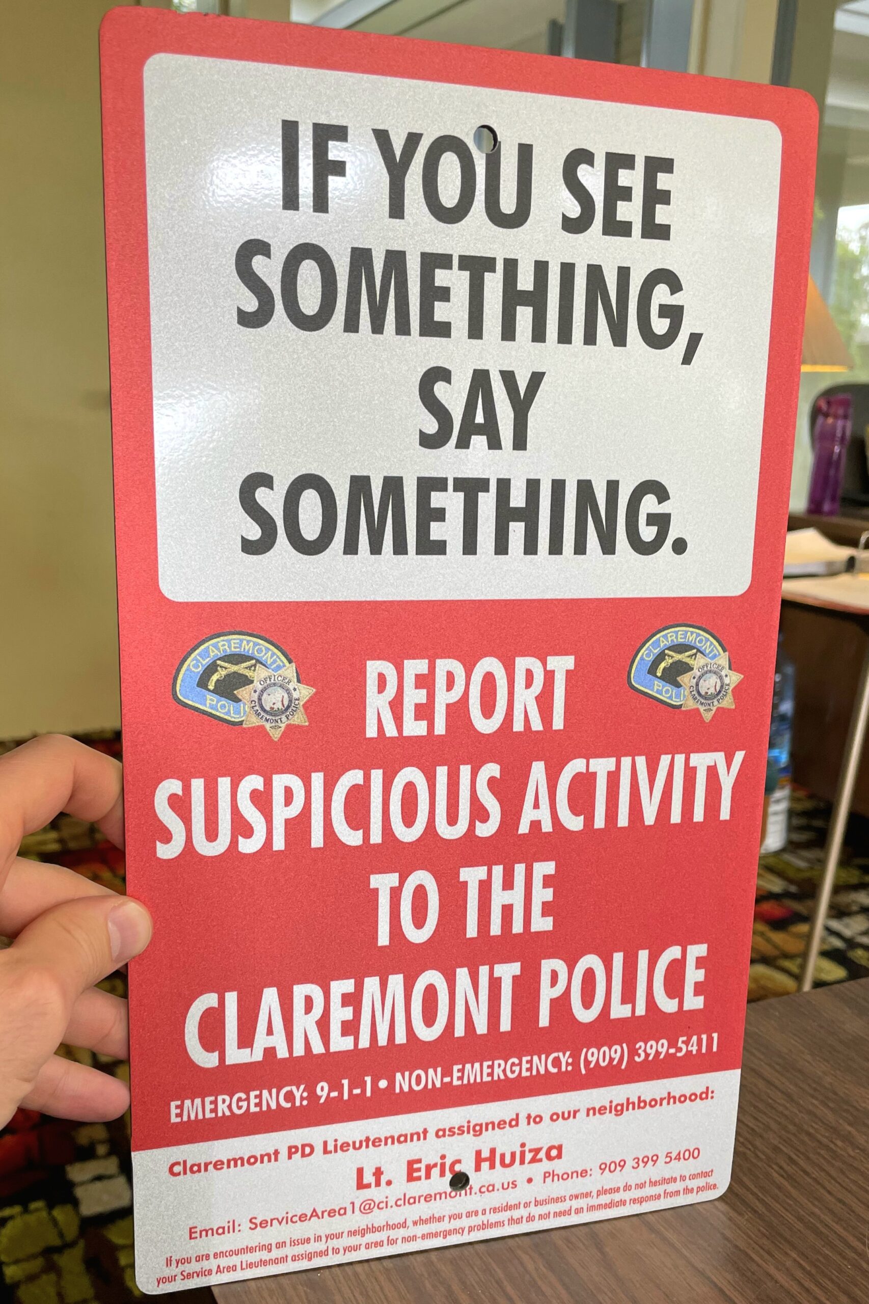
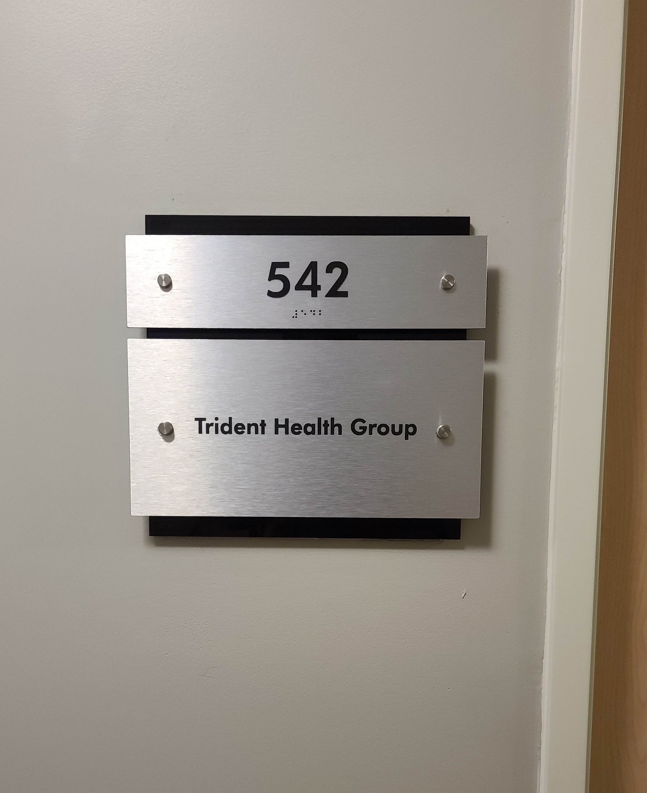
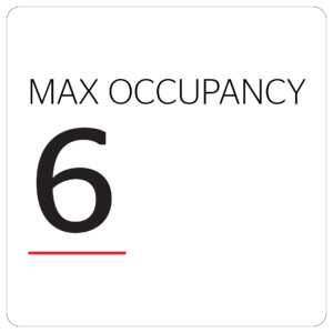
Signage for Safety: Crafting Effective Visual Alerts for a Hazard-Free Environment
Need signage for safety? In a world where accidents can happen in the blink of an eye, safety signage stands as a silent guardian, an unsung hero that tirelessly works to prevent harm. These visual cues, often taken for granted, play a pivotal role in hazard prevention and risk mitigation, serving as constant reminders of potential dangers and promoting safe behavior.
ignage for safety is not just a collection of signs and symbols; it’s a language of safety, a universal communication system that transcends cultural and linguistic barriers. Its effectiveness lies in its simplicity, clarity, and ability to capture attention, even in the most demanding environments.
Studies have shown that effective signage for safety can reduce workplace accidents by up to 30%. This remarkable impact stems from its ability to:
- Warn of potential hazards: Safety signs alert individuals to potential dangers, allowing them to take necessary precautions and avoid harm.
- Provide clear instructions: Simple and direct safety messages provide clear guidance on how to handle hazardous situations or equipment.
- Promote safe behavior: Safety signage serves as a constant reminder of safety protocols, fostering a culture of safety awareness.
Signage for safety is not just a legal requirement; it’s a moral imperative. It’s about protecting lives, preventing injuries, and creating a safer world for everyone.

The Anatomy of Effective Signage for Safety
Our lives are teeming with potential hazards, safety signage stands as a beacon of protection, silently communicating risks and guiding individuals towards safer behavior. But not all safety signs are created equal. To truly safeguard lives and minimize risks, safety signage must be meticulously crafted, adhering to principles that ensure clear, concise, and impactful communication.
Standardized symbols form the cornerstone of effective safety signage. These universally recognized pictograms transcend language barriers, instantly conveying the nature of the hazard without relying on written text. A symbol’s simplicity and clarity are paramount, ensuring immediate comprehension even in fleeting glances.
Clear and concise messaging complements the power of symbols. Safety signs should avoid lengthy, convoluted text, opting instead for direct, straightforward language that spells out the hazard or safety instruction unequivocally. Ambiguity has no place in safety communication; every word must count.
High-contrast color schemes play a pivotal role in making signs stand out against their surroundings. The judicious use of contrasting colors, such as black on yellow or red on white, instantly captures attention, ensuring that safety messages don’t go unnoticed.
Appropriate size and placement are crucial for optimal visibility. Signs should be large enough to be easily seen from a distance, yet not so large as to be obtrusive or overwhelming. Placement is equally important, strategically positioning signs near the hazard or area of concern where they are most likely to be noticed and acted upon.

Designing Signage for Safety for Maximum Impact
Effective safety signage goes beyond mere warnings; it’s a visual language that empowers individuals to navigate hazardous environments safely. To truly maximize the impact of safety signs, consider these design principles:
Visual Hierarchy: Guiding Attention
Emphasize the most crucial information by employing visual cues like size, color, and placement. Larger, bolder elements draw the eye, ensuring that the primary hazard or instruction is prioritized. Color coding, such as red for danger and yellow for caution, further enhances visual hierarchy.
Cultural Sensitivity: Bridging Language Barriers
Cultural sensitivity is paramount in safety communication. Consider the linguistic and cultural background of your audience to ensure understanding. Universal symbols, such as those prescribed by ANSI standards, transcend language barriers, while multilingual signs cater to diverse workforces.
Consistency in Design: Familiarity and Recognition
Maintain a consistent design language across all safety signs to promote familiarity and recognition. Consistent use of colors, symbols, and typography reinforces the visual impact and facilitates rapid comprehension, even in emergency situations.
Identifying Your Audience: Tailored Signage for Safety Messages
To craft effective safety messages, identify your target audience and their unique needs. Assess the level of risk, the type of message required, and the appropriate language for your audience. For instance, signs in industrial settings may differ from those in public spaces.
Color Coding: A Visual Language of Danger
Colors play a vital role in safety signage. Red signifies immediate danger, while yellow indicates caution and potential hazards. Green conveys safety and emergency exits. Understanding the meaning and use of colors according to ANSI/NEMA Z535 standards ensures clear and consistent communication.
Symbol Selection: Universal Understanding
Symbols are the cornerstone of effective safety signage. Standardized symbols, such as those prescribed by ANSI standards, transcend language barriers and provide instant comprehension, even in fleeting glances. Choose symbols that accurately represent the hazard or safety instruction.
Font Choice: Clarity and Legibility
Legibility is paramount in safety communication. Use easy-to-read fonts that are large enough to be seen from a distance. Sans-serif fonts are generally preferred for their clarity and lack of embellishments.
Clear and Concise Wording: Actionable Instructions
Use positive, action-oriented language that clearly conveys the desired behavior. Avoid jargon and technical terms that may confuse or hinder understanding. Specific instructions guide individuals towards safe actions.

Maintenance and Compliance of Signage for Safety
Even the most meticulously crafted safety signs are rendered ineffective if not properly maintained and compliant with safety standards. Regular inspections are crucial to ensure signs are clean, legible, and securely mounted. Regularly clean signs to remove dirt, debris, or damage that could obscure the message. Inspect mounts to ensure they are secure and stable, preventing signs from falling or becoming loose.
Compliance with safety sign standards, such as OSHA, ANSI, and CSA guidelines, is paramount for legal and practical reasons. These standards establish guidelines for sign placement, visibility, and messaging, ensuring consistency and effectiveness across industries. Adherence to these standards helps organizations avoid potential penalties and ensures their safety signage aligns with recognized best practices.
Continuous improvement is the hallmark of an effective safety signage program. Regularly evaluate the effectiveness of your signs by gathering feedback from employees, conducting incident investigations, and analyzing safety data. Use this information to identify areas for improvement, such as updating outdated signs, replacing damaged ones, or adding new signs to address emerging hazards.
By prioritizing maintenance, compliance, and continuous improvement, organizations can ensure that their safety signage remains a powerful tool for preventing accidents and promoting a safe and healthy work environment.
Frequently Asked Questions about Signage for Safety
What are the OSHA signage for safety requirements?
The Occupational Safety and Health Administration (OSHA) is a government agency responsible for setting and enforcing safety standards in the workplace. OSHA has specific requirements for safety signage, including:
- Placement: Signs must be placed in a location where they are visible to employees who may be exposed to the hazard.
- Visibility: Signs must be clearly visible and not obscured by equipment, materials, or other objects.
- Legibility: Signs must be legible and easy to read.
- Durability: Signs must be durable and able to withstand the conditions of the workplace.
- Content: Signs must be accurate and contain the correct information to warn employees about the hazard.
- Compliance with standards: Signs must comply with the applicable OSHA standards.
What are the 4 types of safety signs?
The four main types of safety signs are:
- Danger signs: These signs indicate an immediate hazard that could result in death or serious injury. They are typically red with white lettering and symbols.
- Caution signs: These signs indicate a potential hazard that could result in minor injury or property damage. They are typically yellow with black lettering and symbols.
- Warning signs: These signs provide general safety information or instructions. They are typically green with black lettering and symbols.
- Notice signs: These signs provide information that is not related to a specific hazard. They are typically blue with white lettering and symbols.
What is mandatory on signage for safety sign?
A mandatory safety sign is a sign that requires employees to take a specific action, such as wearing personal protective equipment (PPE) or using a specific procedure. Mandatory safety signs are typically blue with a white circle and symbol.
What should be included on signage for safety?
Safety signage should include the following information:
- The type of hazard
- The potential consequences of the hazard
- The required action to avoid the hazard
- The symbol for the hazard
What are the six categories of signage for the workplace?
The six categories of signage for the workplace are:
- Danger signs: Indicate an immediate hazard that could result in death or serious injury.
- Caution signs: Indicate a potential hazard that could result in minor injury or property damage.
- Warning signs: Provide general safety information or instructions.
- Notice signs: Provide information that is not related to a specific hazard.
- Fire safety signs: Provide information about fire exits, fire extinguishers, and other fire safety equipment.
- Emergency signs: Provide information about emergency procedures, such as evacuation routes and emergency contact information.
What signs are needed in the workplace?
The specific signs needed in the workplace will vary depending on the hazards present. However, some common signs that are needed in most workplaces include:
- Danger signs: For hazards such as electrical hazards, chemical hazards, and confined spaces.
- Caution signs: For hazards such as slippery floors, falling objects, and moving machinery.
- Warning signs: For general safety information, such as “Eye Protection Required” and “Hearing Protection Required.”
- Notice signs: For information such as “No Smoking” and “Authorized Personnel Only.”
- Fire safety signs: For information about fire exits, fire extinguishers, and other fire safety equipment.
- Emergency signs: For information about emergency procedures, such as evacuation routes and emergency contact information.
What are the 7 safety symbols?
The seven most common safety symbols are:
- Danger: A red triangle with a black exclamation point.
- Caution: A yellow diamond with a black exclamation point.
- Warning: A green triangle with a black exclamation point.
- Fire: A red triangle with a stylized flame.
- First aid: A green cross with a white background.
- Eye protection: A stylized pair of safety glasses.
- Hearing protection: A stylized pair of earmuffs.
What Color are mandatory signs?
Mandatory safety signs are typically blue with a white circle and symbol.
What are forbidden safety signs?
Forbidden safety signs are a type of mandatory safety sign that prohibits a specific action. They are typically red with a white circle and symbol with a diagonal slash through it.
What color are fire exit signs?
Fire exit signs are typically green with white lettering and an arrow pointing towards the exit.
What color are exit signs?
Exit signs are typically green with white lettering and an arrow pointing towards the exit.
What is the difference between safety signs and symbols?
Safety signs are Safety signs and safety symbols are both important tools for communicating safety information in the workplace. However, there is a key difference between the two:
- Safety signs are visual messages that convey safety information using a combination of words, symbols, and colors. They are typically used to warn employees about specific hazards or to provide general safety information.
- Safety symbols are standardized pictograms that represent a specific hazard or safety instruction. They are used on safety signs, as well as on other safety materials, such as labels and training materials.
Here is a table summarizing the key differences between safety signs and safety symbols:
| Feature | Safety Signs | Safety Symbols |
| Purpose | Convey safety information using a combination of words, symbols, and colors | Represent a specific hazard or safety instruction |
| Form | Visual messages | Standardized pictograms |
| Usage | Used on safety signs, labels, and other safety materials | Used on safety signs, labels, and other safety materials |
| Examples | “Danger: Electrical Hazard,” “No Smoking,” “Eye Protection Required” | Danger symbol (red triangle with exclamation point), Fire exit symbol (green running man), Hearing protection symbol (stylized earmuffs) |
In addition to the above, here are some additional points to consider:
- Safety signs are typically larger and more detailed than safety symbols. This is because they need to convey more information, such as the type of hazard, the potential consequences of the hazard, and the required action to avoid the hazard.
- Safety symbols are more universal than safety signs. This is because they are not language-dependent. As a result, they can be understood by people from all over the world.
Where do you put safety signage?
Safety signage should be placed in a location where it is visible to employees who may be exposed to the hazard. The specific location of the sign will vary depending on the hazard. For example, a sign warning about an electrical hazard should be placed near the electrical panel.
Here are some general guidelines for placing safety signage:
- Place signs in areas where employees are likely to see them. This includes areas where they are working, as well as areas where they are walking or driving.
- Place signs at a height where they can be easily seen. This is typically between 5 feet and 6 feet above the ground.
- Do not place signs too close together. This can make them difficult to read and understand.
- Make sure that signs are not obscured by
What is the standard height of safety signage?
The recommended height for installation of safety signs is 2 meters to 2.5 meters from floor level to the bottom of the sign. This height ensures that the sign is visible to employees of all heights and can be easily read without straining or reaching. It also helps prevent the sign from being obscured by machinery or other objects.
What does the O stand for in a pictogram?
The “O” in a pictogram typically stands for “obligation” or “mandatory.” It indicates that the pictogram is representing a mandatory action or requirement. For example, a pictogram with a person wearing safety glasses and an “O” symbol signifies that eye protection is mandatory in that area.
What does GHS stand for?
GHS stands for Globally Harmonized System of Classification and Labeling of Chemicals. It is an international system for classifying and labeling hazardous chemicals. GHS symbols are often used on safety signs and labels to warn about chemical hazards.
What are the OSHA safety colors?
The OSHA safety colors are:
- Red: Danger
- Yellow: Caution
- Green: Safety
- Blue: Mandatory
- White: Information
What is the acute toxic symbol?
The acute toxic symbol is a skull and crossbones pictogram used to warn about substances that are acutely toxic. Acute toxicity refers to the ability of a substance to cause harm or death after a single or short exposure. The acute toxic symbol is typically found on safety signs and labels for pesticides, herbicides, and other hazardous chemicals.
For more details on speciations for signage for safety you can visit California safety sign regulations.


Let Us Help You With Signage for Safety
Signage for Safety is not just a passive element of hazard prevention; it’s an active force for safety, a silent sentinel that tirelessly watches over us. By understanding and applying the best practices for creating effective safety signs, we can transform these visual cues into powerful tools for preventing accidents, promoting safe behavior, and safeguarding lives. Remember, safety is not a destination; it’s a journey, and safety signage is our compass, guiding us towards a hazard-free environment.
Contact Us
If you need help creating effective safety signs for your workplace or business, contact Premium Sign Solutions today. We have a team of experts who can help you design and implement a safety signage program that meets your specific needs and complies with all applicable regulations.

