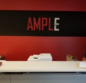
Reception Sign for Ample Entertainment in Culver City

First impressions count. That’s why we made this impressive reception sign for Ample. It is comprised of 1.5 inch thick acrylic letters with custom paint splatter to match the Culver City company’s identity. With this, visitors and customers will get a feel for what the brand stands for. Likewise, it makes the place look more presentable. All of these being important aspects for a company in the media industry.

(more…)

Continue ReadingReception Sign for Ample Entertainment in Culver City

The Best Worst Business Signs

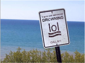
What makes a business sign memorable? Sometimes, it’s the sleek design and eye-catching colors. Other times, it’s the oops moments – typos, poorly thought-out messages, or downright hilarious errors. We signmakers have a keen eye for what makes signs great. There are plenty of design techniques we employ to make sure business signs serves it’s main purpose – to catch eyes and promote brands. But that also means we see our fair share of hilarious signs with unintended messaging. Here are a few of our favorites: Let’s explore why good design matters and how to avoid these common pitfalls!

(more…)

Continue ReadingThe Best Worst Business Signs