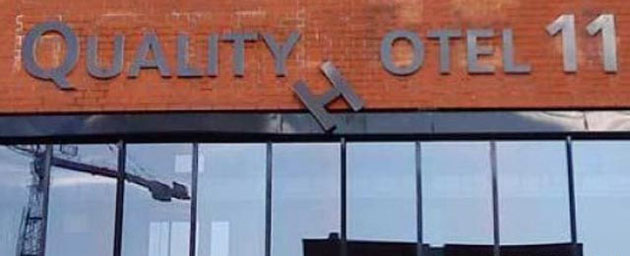
What message is your sign sending? Your advertising may boast that your products are the best, but does your signage represent you differently? Make sure you’re not sending customers mixed signals by neglecting your image.
In this month’s spotlight “Bad Sign,” Red Room, an upscale food and wine bar has a graffiti covered three-year old banner draped over where it’s permanent street-facing sign should go. With a menu that appeals to sophisticated clientele, does their sign convey that same image?
Make a resolution this year to invest in your company’s branding. You spend tens of thousands of dollars annually on advertising; why not make the greatest marketing choice by updating or replacing your bad sign! If you’d like to discuss your sign strategy – or have a bad sign you think we should highlight next month, Contact Us today!


