How a Stone Monument Signs Creates A Lasting Impression For Pierce Bros
What story does your property tell visitors before anyone even steps inside? Could a sign shape perceptions and convey your values instantly? When a potential customers approaches your building for the first time. Their first impression is crucial, and the right signage can make all the difference. Let’s go deep into the design process behind the Pierce Bros stone monument sign, highlighting the key considerations that ensure a lasting impact.
The Pierce Bros Story and Our Collaboration for Their Success
How do you create a sign that not only directs but deeply connects with its audience? Pierce Bros, a trusted name in funeral services, recently approached us to create a landmark entrance sign for their Westlake Village location. Their goal? To establish a welcoming and dignified presence that reflects their values. We knew collaboration was key. By understanding their target audience and the surrounding environment, we created a design that would resonate with their visitors. Discover how collaboration and understanding led to a custom designed sign that reflects both dignity and distinction.

Concept to Sketch Where Design Takes Flight
Where does great signage truly begin – with an idea or the story it aims to tell? Here’s a glimpse into the initial stages of design. We explored various concepts, considering the message Pierce Bros. wanted to convey and the overall aesthetic they desired. We research the industry best practices and analyzed successful examples of monument signs in the funeral service sector. Our team translated ideas into hand-drawn and digital sketches, refining the design until their vision was brought to life. Follow the journey from sketchpad to street corner and see how thoughtful concepts lay the foundation for impactful signage.
The Science Behind the Design, Color Theory & Shape Psychology
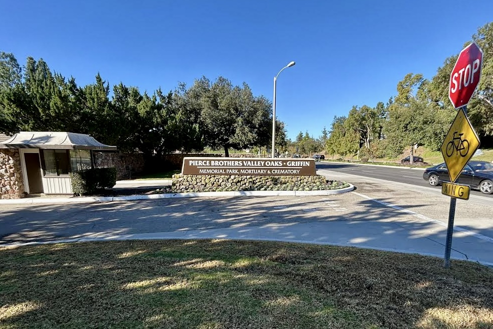
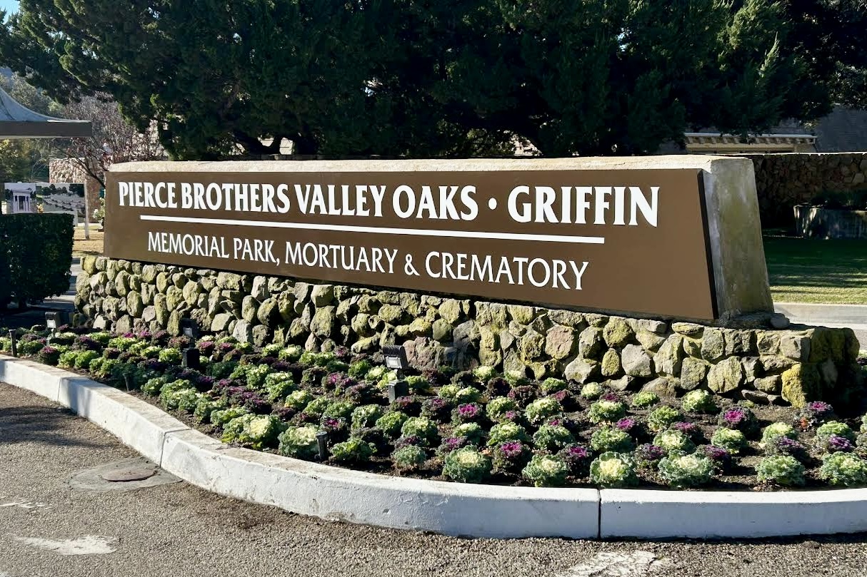
Did you know that even the smallest design details, like colors and curves, can influence how people feel about your business? The pavement sign. features a classic yet impactful combination of white lettering on a brown background. So what’s the science behind this choice? White offers excellent contrast against the brown background, ensuring optimal readability from afar, especially in bright daylight conditions. Additionally, the brown complements the natural elements of the rock base and surrounding landscaping, creating a cohesive and enduring look. The clean rectangular shapes used for the text areas, prioritize clarity and professionalism. To soften the overall feel, the incorporation of gentle curves into the design fosters a sense of welcome.
The Stone Monument Sign Design is a Blend of Style and Function
What’s the secret to creating a sign that’s both a work of art and a practical business tool? The sign exemplifies a perfect balance of form and function. Here’s a closer look at the key design elements:
- Overall Size: Each sign side measures 33 inches high by 285 inches wide, ensuring optimal visibility from a distance.
- Construction: The signs feature a robust 2 inches by 2 inches architectural aluminum angle welded frame, providing a strong and durable foundation.
- Face Material: ⅛ inch thick aluminum faces are used, offering a sleek and modern aesthetic.
- Finish: The frames are primed and painted in a satin black finish for a sophisticated and timeless look.
- Lettering: 3M high-performance matte white cut-out vinyl decals are used to create the lettering and logos, ensuring long-lasting durability and vibrant colors.
This combination of materials and construction techniques results in a high-quality sign that is both visually appealing and built to withstand the elements.
Brand Alignment Creates A Cohesive Experience
Can signage do more than guide – can it echo your values and reinforce your brand’s promise? Here’s how the Pierce Bros’ sign achieve seamless brand alignment:
- Consistency is Key: The white and brown color scheme will reflect the established brand palette for a unified visual identity. Additionally, the chosen fonts will align with those used on their other branding materials, creating a consistent and recognizable experience for visitors.
- Nature’s Touch: The incorporation of natural elements like rocks and plants subtly reflects their commitment to creating tranquil and serene environments.
This blend doesn’t just attract attention; it builds trust and ensures your message reaches every passerby effectively.

Beyond Aesthetics Lies Functionality
What happens when a sign doesn’t just look good but also serves as a beacon of practicality and clarity? A well-designed curb sign is more than just visually appealing. Here’s how the Pierce Bros. sign prioritizes functionality:
- Placement & Size: The sign is strategically positioned for optimal visibility from the main road, considering traffic flow and viewing angles. The size of the letters will be carefully calibrated to ensure clarity for both drivers and pedestrians.
- Surrounding Elements: The decorative cabbage landscaping used to frame the sign, drawing attention to its message. The overall design will complement the surrounding architecture and natural landscape, ensuring a harmonious look.
You may want more information to help you choose look here to learn how to choose outdoor signage size to maximize visibility and impact. Or to understand the differences between pylon signs vs monument signs to select the best solution for your property. As a trusted provider of Thousand Oaks monument signs, we help businesses create landmarks that stand out.
Ready to Make a Lasting Impression?
What could your signage be saying about your business right now? At Premium Sign Solutions, we understand the importance of effective signage for facilities management professionals. We offer a comprehensive range of signage solutions, from design and sign fabrication to signage installation to ensure you get the best eyes on your brand. Let us help you create signs that don’t just guide but inspire, resonate, and elevate your brand. Contact us today to bring your vision to life.


