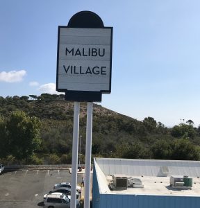
Designing signage isn’t quick and easy, even if it’s just something that can be printed quickly like stickers or vinyl wraps. It’s not just about doing some Photoshop wizardry, printing it out and viola, sticking it on the storefront. Depending on the materials being printed on, ink quality, the printer itself, and a whole bunch of factors, the results might actually look quite different than what’s on the computer. Color matching is especially tricky. That’s where a good eye and some good old-fashioned tools come in.
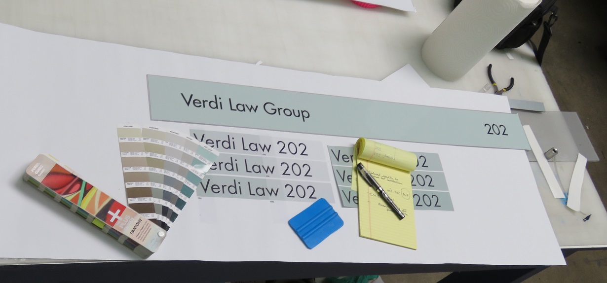
When it comes out of our HP 360 printer, we’ll have to see how it actually looks like since the actual thing isn’t going to be exactly the same as what you see on a computer screen. We’ll eyeball it and compare it to a Pantone color wheel. We’ll print variations of each color to see which point in the color spectrum reacts with our choice of vinyl and lamination for the job. After all, a quality sign has to look just right!
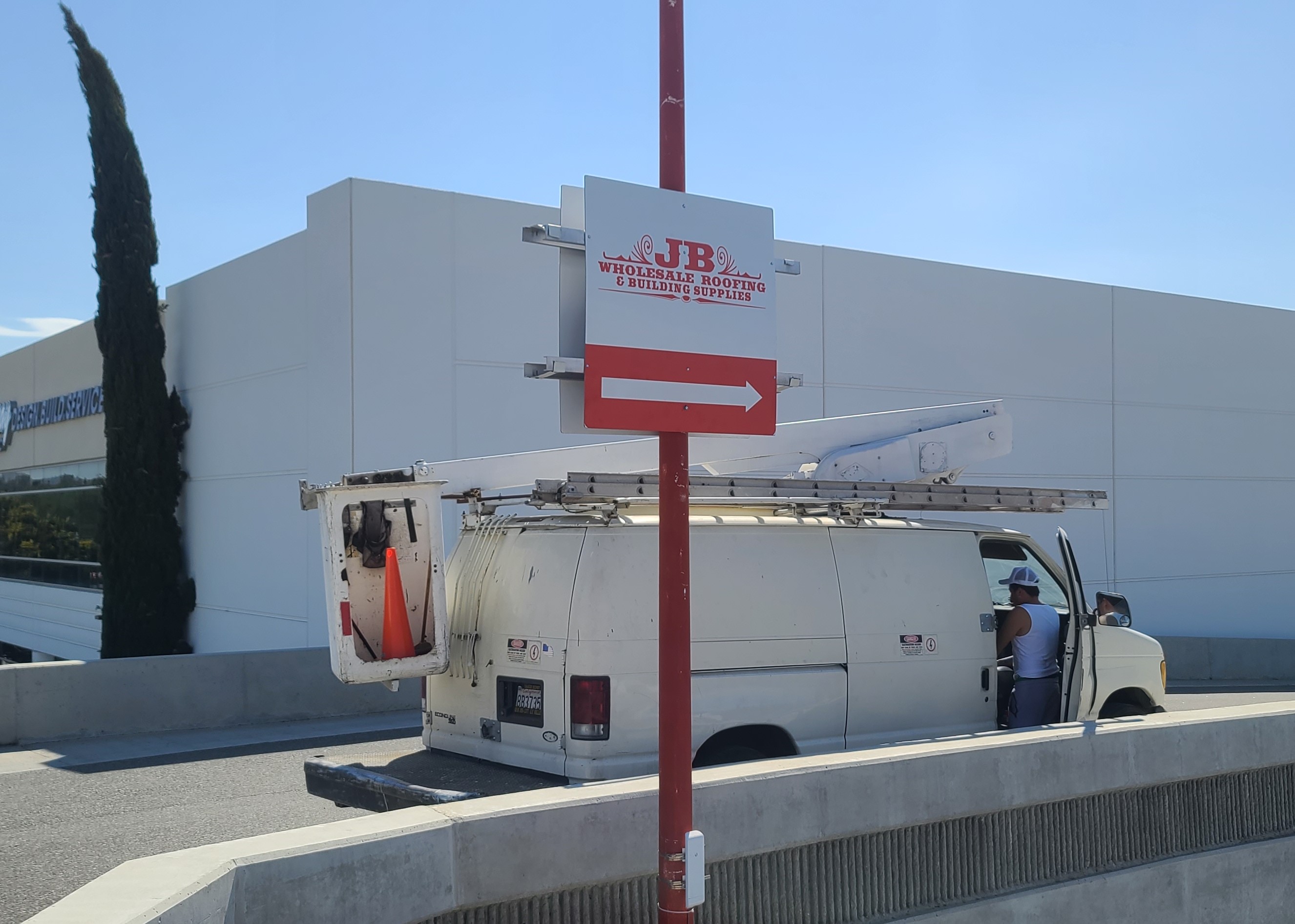
Sometimes, if we’re following the colors of a pre-existing sign, we might use an actual physical sample of the original for comparison. We’d really prefer it if clients send us the original high resolution files, but if they’ve lost it then a simple photograph or, heavens forbid, a low-resolution one, just won’t do. Photos won’t do justice since the lighting can change how a sign looks – an indoor sign in a restaurant will look different from a lobby sign that’s brightly lit, whereas an outdoor sign under natural lightning is something else entirely.
Overlooking the details is what leads to project pitfalls that a lot do fall for.
This is why the experience of seasoned sign-makers is invaluable – especially if you’re in a highly competitive area, like Los Angeles of the San Fernando Valley region. In such scenes, you’ll want the best color combinations for sign visibility and that’s what we bring to the table: the keen eyes, attention to detail, the array of tools and techniques we can draw upon, all to meet your needs in the best way possible. There’s no substitute for quality!
