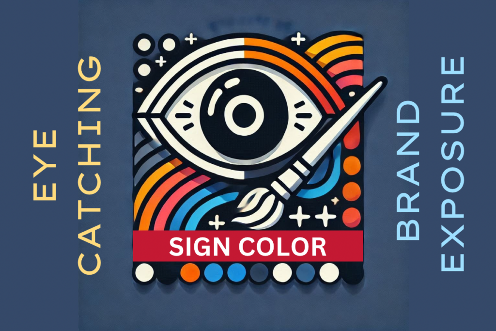
How the Right Colors Make Your Signs Unmissable
Did you know that the colors you choose for your signs play a significant role in attracting attention and conveying your brand’s message? We’ve already talked about the basics of how signs send a message. Do you know that this also applies to the color combinations you use for your signs? Yes, the types of colors you choose will affect your business’ visibility, which is crucial in highly competitive areas like Los Angeles or San Fernando Valley. This applies to everything from your outdoor signs to your indoor signs, and of course the aesthetics of the rest of your establishments. It’ll help to get a better idea of how color combinations can help your business stand out!
Colors Have Meaning
Ever wondered why McDonald’s chose red and yellow? These bold, high-contrast colors are scientifically proven to grab attention and stimulate appetite, which is why they’re so effective for outdoor signage, like pylon signs or monument signs in high-traffic areas. They’re bright and contrasting and make the perfect match according to the color combination chart above. The warmth of the colors matches the nature of the establishment as a fastfood chain. If you’re on the road and you see the logo, with those colors, on a pylon sign, chances are your mouth’s gonna water and you’ll end up going for some drive-through.
Industry-Specific Color Considerations
What if the wrong color made your audience look away? Each industry thrives on specific palettes – let’s break them down. Colors like purple, neon or minty green, or formal black and white may not align with a brands identity. They must reflect what the business does, who they service, and the demographics they target. Neon green won’t make you think of cheeseburgers.
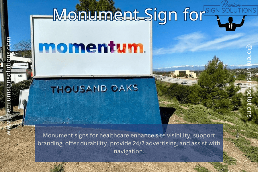
- Healthcare: Calm and soothing colors like light blues, greens, and pastels can create a sense of trust and tranquility.
- Education: Bright and cheerful colors can be used for schools, while more muted tones might be suitable for universities.
- Financial Institutions: Blue and green often convey trust and stability, while gold can symbolize wealth and prestige.
- The Importance of Target Audience: Color choices should consider the target audience and their demographics. Brighter, more vibrant colors, for example, may be more appealing to younger audiences.
Colors aren’t just visuals, they tell your brand’s story. Are yours saying the right things?
Technology Sector
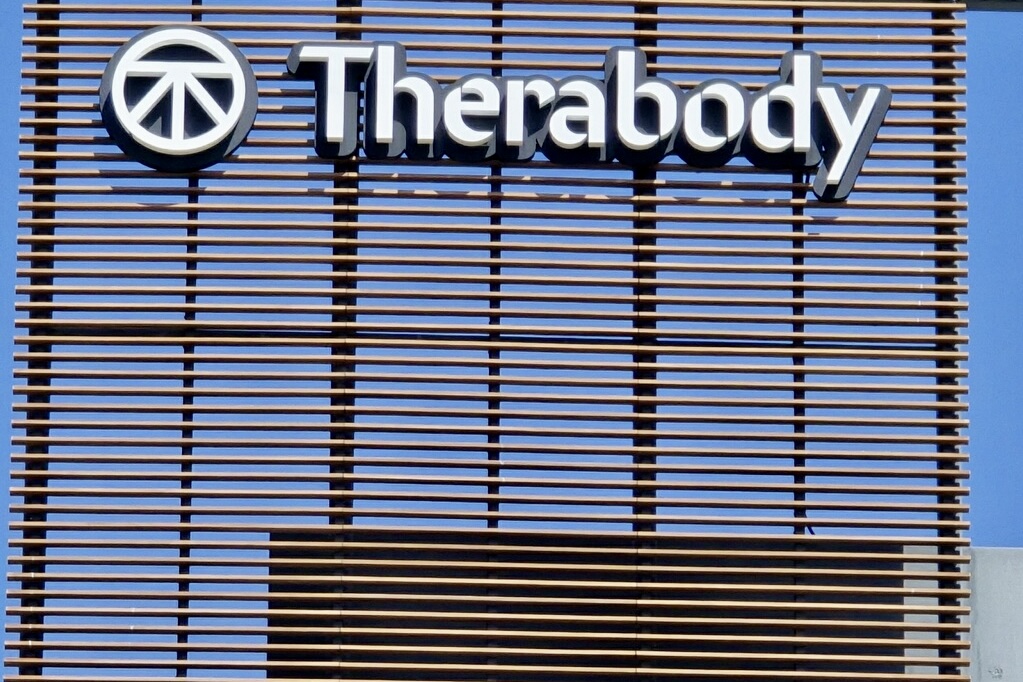
Red and yellow won’t make you think of iPhones either, since establishments dealing with technical fields wouldn’t be served well with colors befitting a fastfood chain. You’ll want something clean and clinical, sleek and minimalist – the business sign, and even the visuals of the establishment itself, must be as clean and optimized as a touchscreen or a desktop interface.
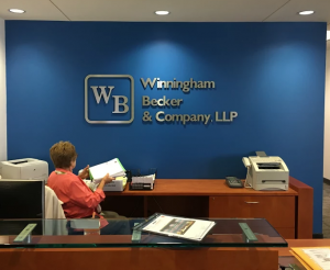
Professional Services
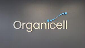
A corporate establishment, or something like a law firm, would work with more muted colors that go well with a sleek lobby sign displaying a modern logo. A high tech software development company could apply similar aesthetics, but then again an environment full of creative types may be less formal and could use bright and contrasting colors that are stimulating to the mind and convey a theme of playfulness that comes with innovation and imagination.
Hospitality and Food Service
Even cafes use the same principles. Those hand-carved wooden signs, the comfortable chairs and tables, the up-scale look that makes you want to just sit back, relax and read a novel while enjoying your brew? They’re engineered to convey an authentic feel to match the authenticity of the pricey coffee they serve.

Really Useful Tools and Resources for Color Selection
Aside from the color combination chart above, you can try this interactive game to gauge your aptitude for matching colors. Fun aside next up are the technical aspects to think about.
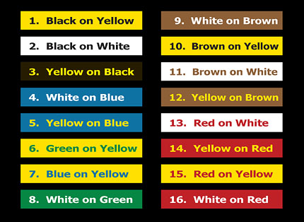
Most Visible Color Combinations for Signs
Want your sign to stand out from 400 feet away? These proven color combos grab attention in any environment.
Black on Yellow
- High-contrast ratio and visibility from distance
- Ideal for warning signs and important announcements
- Visibility distance: Up to 400 feet in daylight
White on Blue
- Professional appearance with excellent readability
- Perfect for corporate signage and directional signs
- Maintains visibility in various lighting conditions
Yellow on Black
- Second-highest visibility rating
- Excellent for nighttime visibility
- Popular choice for construction and safety signs
White on Red
- Creates urgency and draws immediate attention
- Commonly used for sale signs and promotions
- High visibility in both day and night conditions
Black on White
- Classic combination with universal readability
- Best for detailed information and small text
- Maintains clarity in most lighting conditions
Perfect color contrast means your sign gets noticed — day or night. How can you ensure it’s seen everywhere?
Color Contrast Guidelines for Maximum Visibility
What adjustments could improve your sign’s readability? By optimizing contrast you increase viewing distance effectively.
Best Practices
- Maintain a minimum contrast ratio of 7:1 for optimal readability
- Use light colors on dark backgrounds for nighttime visibility
- Consider color-blind accessibility when selecting combinations
- Ensure text color stands out against the background
Visibility Factors to Consider
- Viewing distance
- Lighting conditions
- Environmental context
- Target audience demographics
- Sign location and surroundings
Industry-Specific Color Combinations
How can the right colors help your brand connect with your target audience? By aligning your signage’s color palette with industry norms, you can enhance brand recognition, evoke the right emotions, and create a cohesive identity that resonates with your customers. Let’s explore what works best for the fill specific industries.
Retail and Restaurants
- Red and Yellow: Creates hunger response (fast food)
- Green and White: Fresh, organic feel (health food)
- Blue and White: Clean, trustworthy (banking, healthcare)
- Black and Gold: Luxury and premium quality
Professional Services
- Navy and White: Corporate trust and stability
- Gray and White: Professional and modern
- Blue and Silver: Tech-savvy and innovative
- Green and Black: Financial and growth-oriented
Especially when ADA signs are needed contrast is important for accessibility.
Technical Specifications for Sign Colors
Which colors offer the best visibility and impact for your signage? Choosing the right color values is essential for ensuring your signs are eye-catching, readable, and aligned with your brand’s goals. Here are the top color recommendations for achieving maximum effectiveness in any environment.
Recommended Color Values
- High-Visibility Yellow (#FFEB3B) – Think of the vibrant yellow often used in road signs and safety vests. It catches attention quickly.
- Safety Red (#FF0000) – A strong, clear red used in stop signs and emergency buttons. It signifies urgency and danger.
- Corporate Blue (#0D47A1) – A deep, professional blue often seen in logos and corporate branding. It exudes trust and reliability.
- Professional Black (#000000) – The classic black used in text and formal signage. It’s clear, bold, and professional.
- Pure White (#FFFFFF) – The clean, bright white that’s used for high contrast and clarity in signage. It’s versatile and essential.
Contrast Ratios for Common Combinations
Contrast ratios are crucial for ensuring text and graphics are easily readable. Here’s a breakdown of those common combinations:
- Black on Yellow (14.3:1) – Excellent contrast, ideal for warning and caution signs.
- White on Blue (12.5:1) – Clear and readable, often used for informational signs.
- Yellow on Black (13.8:1) – High contrast, commonly seen in hazard signs.
- White on Red (9.2:1) – Good contrast, typically used in emergency and stop signs.
- Black on White (21:1) – The highest contrast ratio, perfect for ensuring maximum readability in all conditions.
These ratios help determine the effectiveness of signage in various lighting conditions and viewing distances.
Environmental Considerations
Environmental Considerations
How can your signage remain effective no matter the time of day? Adapting your sign’s design to different lighting conditions ensures it stands out and remains readable around the clock. Whether it’s optimizing for bright daylight or ensuring visibility at night, these tips will help your signage perform in any environment.
Daytime Visibility
- Use darker text on lighter backgrounds
- Avoid reflective materials that cause glare
- Consider shadow effects from sunlight
Nighttime Visibility
- Use lighter text on darker backgrounds
- Consider illumination options
- Use reflective materials when appropriate
Testing Your Sign’s Visibility
How can you be sure your sign grabs attention? Testing ensures your design works in real-world conditions. Before finalizing your sign design:
- Test visibility from various distances
- Check readability in different lighting conditions
- Verify contrast ratios using digital tools
- Get feedback from potential viewers
- Consider weather impacts on color durability
With testing, you’ll know your sign performs perfectly. If you want to learn more about sign design there is more Ready to protect that visibility for years to come?
Maintenance Tips for Color Longevity
Keep your brand glimmering bright by protecting the brilliance of your sign. Are you willing to invest in long-term visibility?
- Use UV-resistant materials
- Clean signs regularly
- Apply protective coatings
- Schedule periodic color touch-ups
- Monitor for color fading
Professional Expertise in Sign Design
Overwhelmed by color choices? Let experts transform your ideas into a design that works and wows. Of course, determining which colors work well together can get technical, delving into visual design or graphic art territories where terms like hues and gradients are thrown around. That’s why if you’re in the process of conceiving a sign, it’s really useful to have professional input from professional sign-makers. Specialists well-versed in the art of sign making have both theory and practical experience, so they’ll be best equipped to answer your questions and meet your signage aesthetics needs. So don’t hesitate to ask!
Mind your color combinations. Be bold when you need to be. Or be subdued and professional, minimalist when called for. Mix the colors right, make sure the letters and the logos are visible and comprehensible without clashing with the backdrop. Remember, aesthetics matter in branding, it must be congruent and complementary with the product you offer. That’s how you can stick out from the rest! Great design is about more than colors – it’s about creating impact. Ready to make your brand unforgettable? Schedule a free consultation contact us today!