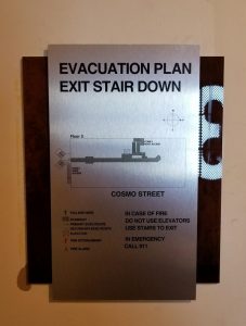
A good sign attracts the right customer and grabs their attention. How you design your custom signage is essential to effectively communicating your brand’s message. Whether you are trying to make a gorgeous office sign or an eye-catching building entrance, you should know the basics. In this blog, we will look at four design principles for signs that are absolutely necessary if you want your office or structure to be noticed for having an eye-catching and powerful display.
1. Understand Your Brand and Message:
Understanding the brand’s objectives and goals is crucial before diving into the design process. The brand will be reflected on the signage of the business, which should align with the brand identity and aesthetics. Think about the feelings and principles connected to your brand, and incorporate them into the design. Your signage will be more memorable to viewers and help to reinforce your brand identity if it has a clear and compelling message.
2. Simplicity and Clarity:
In the modern world of minimalism, less is more. Keep your design straightforward and simple enough to understand at a glance. Avoid overusing text or graphics on the sign that could confuse or distract the reader. Attempt to convey your message as simply and effectively as possible with a tidy and organized layout. Make every element of your sign count because you might only have a short time to grab attention.
3. Choose the Right Colors and Fonts:
Color and typography are strong design components that affect the mood and perception of your signage. Choose colors that are consistent with your brand and evoke the desired emotions. Make sure the text and background have contrasting colors to improve visibility and facilitate reading. Choose readable, clear typefaces that go well with your brand’s aesthetic when it comes to fonts.
4. Balance Proportions and Size:
For visual consistency and readability, your signage’s dimensions and proportions are essential. When choosing the dimensions, take into account the sign’s placement and viewing distance. A sign that is too small could go unnoticed, whereas a sign that is too big could be intimidating. To create a balanced composition and a visually appealing and functional sign, make sure the elements are the right sizes in relation to one another.
How Premium Sign Solutions Can Help:
Premium Sign Solution has experts that understand the goals of the clients and provide the best solutions. We offer quality materials for all your projects and state-of-the-art technology to create signs that are durable, long-lasting, and able to withstand various weather conditions. We handle every stage of the process, from design conception to fabrication, installation, and even maintenance, guaranteeing a seamless and stress-free experience for our clients.
Conclusion:
You have the chance to present your brand identity and leave a lasting impression on your audience when you design custom signage for your workplace or building. You can design a sign that stands out from the competition and makes a good first impression by keeping these four design principles in mind: brand awareness, simplicity, color and typography, and proportions. Bringing your vision to life is made simple and rewarding with the knowledge and complete sign solutions offered by Premium Sign Solutions.


