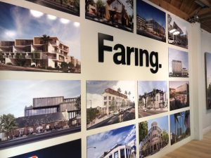
When it comes to what looks best, a comprehensive sign package is your best bet to create aesthetically pleasing and functional signage. These will truly amplify your branding’s effect i the San Fernando Valley area. Too often building and wayfinding signs are afterthoughts. They are only considered when time and what’s cheapest is all that matters. But shouldn’t your signs match your architecture and general design?
Consistency is Key and That’s What a Sign Package Offers
So, you want to elevate your brand and your business. Do you think signage that looks inconsistent, haphazard and designed at the last minute will have that effect? Such signage will deliver the opposite message, and customers will see that you aren’t the most well-prepared or well-organized operation. They also won’t be functional, their inconsistency will make them hard to recognize, or actively turn them into eye-sores that people will try to avoid.
 Conversely, with a sign package your wayfinding signs will have consistency of appearance and quality. The fonts, the sizes, colors and standard of materials used will match. Uniformity leads to functionality: people will know what your signs look like as they will catch the eye. Likewise, their design will compliment your branding and your establishment’s layout and appearance.
One case study is how New York City’s parks signs got revamped into uniform, aesthetically pleasing, legible and ultimately functional signage.
 So, by displaying signage that have thought and effort put into them, you will elevate your brand by showing customers you’ve got your affairs in order.
Looking to up your condominium, apartment or property’s signage game? Contact Premium Sign Solutions. Southern California Sign Company based in San Fernando Valley.


