Your potential customers in Los Angeles and the San Fernando Valley see signs and gauge businesses accordingly even before they step through the front door! Moreover, the consistency of your signs sends a message to customers and onlookers, along with how your signs match your establishment’s aesthetics, and how the appearances of both signs and establishment conform with your brand identity.
These factors are crucial in impressing potential customers, even in retaining current and previous customers. They complement or supplement the quality of the actual products or services you offer. Thus, the following should be kept in mind when thinking about signs, the aesthetics of your place of business, and how these relate to your products/services and brand identity:
- Consistent aesthetics show customers that you have your affairs in order. It reinforces your brand identity and the consistency of appearance is also a signal that other aspects of your business will be likewise consistent. On the other hand, inconsistent appearances will leave customers scratching their heads as to the identity of your business and that in turn may affect their certainty of your products or services.
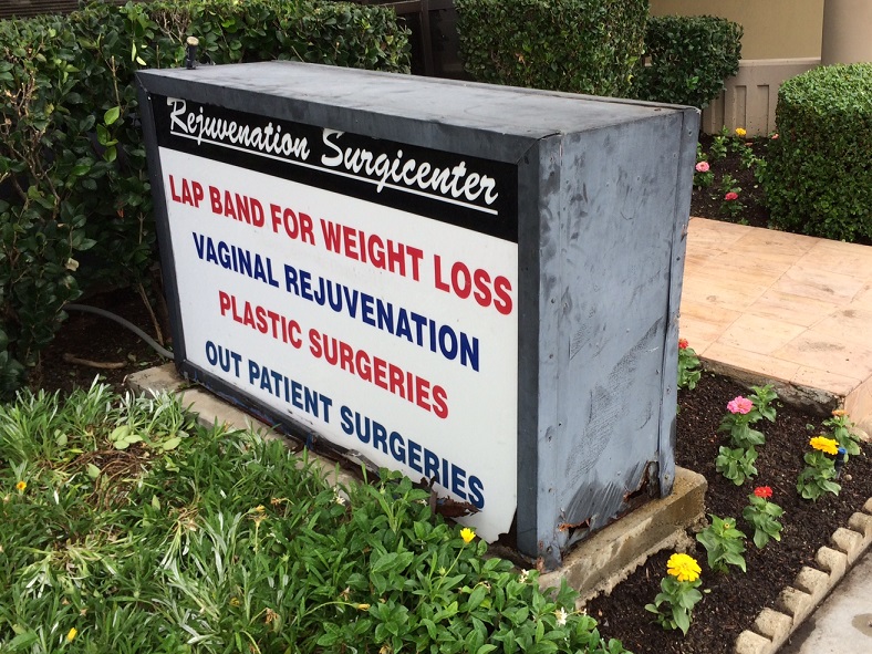
- The suggestive power of signs means that signs should be in impeccable condition, since a dilapidated sign will give your potential customers an impression that you might not want them to have – and that’s before they even step foot into your establishment to see what you’ve actually got! In the featured image above, the sign in question belongs to a medical facility, but how confident would potential clients be in entrusting the place with their health and bodies if the center can’t even maintain a simple sign? (Not to mention the sign’s questionable fonts!)
- Signs build upon mood or theme, which reinforces the product you’re providing. For example, bright neon signs more suited for a bar or a club would look out of place in a high-end iStore or cafe with rustic aesthetics and hand-carved wooden signs. Metal dimensional letters that look suited to an office lobby might not be the best for a family-oriented restaurant, either.
- Inconsistent branding is a no-no. This can occur because the signs were bought at separate times from separate sign-makers, when the owner’s vision changes, or when there’s a new owner. This can also happen when attention to detail is lacking. Sign packages provided by a meticulous and professional sign-maker can help avoid this. Open communications with the sign-maker, and giving them a good idea of what your business is going for, can minimize the risk of inconsistent signage.
- It’s important for establishments to know when to retire old signs, not only when in the physical sense when the sign’s worn down but also in the aesthetic sense when a certain logo’s appearance has become dated. Be careful with this though, since an image takes some time to be familiar to customers and bury itself in their psyche, so there’s a line between replacing an obsolete sign/logo and needlessly retiring something that’s still effective.
These are just some key aspects of the messaging inherent in signs, aesthetics and branding. These involve the visual language and audience psychology, and understanding a bit of these can be really helpful in not only the sign-making business but also in running an establishment and promoting a business. After all, it’s like what they say, that’s show business!


