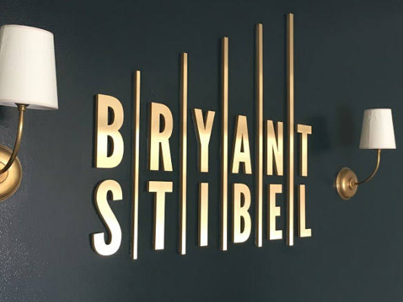
Make sure your business lobby sign fits into your interior design aesthetic. After all, when decorating offices, each element – reception desk, furniture, paint colors, lighting – is carefully considered. On the other hand, we often see companies make the visual mistake of selecting a sign as an afterthought in an otherwise beautifully crafted office. So ideally, signage should serve as the centerpiece of an office that compliments its surroundings, and vice versa.
Brands and Spaces Come to Life with a Business Lobby Sign
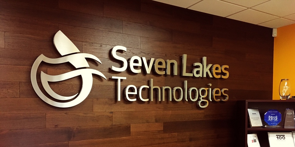 Signs embody brands, but a company or organization’s identity should be projected in other ways too. Likewise, the very look of the entire office, the colors being used, the decorations, it should all come together. So both customers and employees alike will remember what the brand is here for.
Otherwise, clashing signage and surroundings might send mixed messages that will confuse or subtly turn off people, or just undermine your sign’s messaging, decreasing your brand’s memorability.
This is why a business lobby sign must go hand in hand with its surroundings. Aside from the furniture and decorations, this can include other interior signs as well. Consistent signage matters, and our sign packages can help with this.
As we said before, this is something that must be considered carefully. Which means the brand must know what it stands for, so its interior aesthetics – from walls and flooring to decorations and signage – will reinforce that direction.
Presenting Your Image
 For example, a tech firm or startup would have entirely different interior aesthetics than a fashion boutique. Sleek metallic signage can go well with minimalist furniture, and a general shiny futuristic look.
In the case of formal and corporate businesses, like law firms or property managers, they can go with dimensional letters in classy fonts. While the surroundings look more contemporary or perhaps rustic to convey the firm’s history.
Whereas with media and marketing companies, fashion agencies and so on, they need lobby signage that convey their raw creativity. Likewise their centerpiece has to be eye-catching, aesthetically pleasing and maybe even surprising.
Consider Your Brand’s Style
 So think about how you want your brand to present itself. What you want customers to associate it with, so it can stand out from the competition. Then plan accordingly and try to make the signage and interior design and decor compliment one another. If you want help with figuring this out, just reach out to your friendly neighborhood sign makers.
Contact Premium Sign Solutions. Southern California Sign Company based in San Fernando Valley.

