How Brand Consistency Can Improve Wayfinding, Branding, and Safety
Have you ever wandered into a large building or complex, only to be met with a sea of confusing signs? The brand consistency seems missing.
Or are wondered why some signs look completely different from others, leaving you feeling lost and uncertain?
If so, you’re not alone.
The importance of consistent signage in such environments cannot be overstated.
Key Takeaway Points
- Consistent signage enhances brand recognition and improves customer wayfinding experience.
- Unified themes create a professional ambiance and elevate a building’s image.
- Modern trends like digital signage and minimalistic design influence current signage aesthetics.
- Accessibility considerations cater to the needs of all visitors, ensuring inclusivity.
- Well-designed consistent signs boost safety by providing clear directions during emergencies.
In this article, we’ll explore the significance of maintaining consistency in signage, particularly with regard to brand colors, signage style, and types for you. Just like the way carefully selected furniture in a room can create a harmonious and inviting atmosphere.
And how mismatched clothes can make a person look unkempt. Consistent signage plays a crucial role in large buildings and complexes. It serves as a visual language that guides and informs visitors while reinforcing brand identity and safety protocols.
So, let’s embark on a journey to discover the power of unified and well-designed signs in large buildings and complexes.
Signage Industry Insights on Brand Consistency
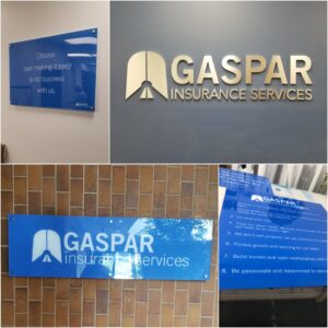
In the world of signage, consistency is a powerful tool that impacts your business’s image and customer experience. Several companies successfully implement consistent signage strategies, like Gaspar, which revamped its signage for a unified branding theme.
As a result, visitors now feel welcomed from the moment they arrive at the facility and throughout their entire journey within it. The use of uniform signage at Gaspar has created a sense of comfort and familiarity, reinforcing their brand and making the space more inviting for their customers.
Latest trends in signage design constantly evolve, driven by technological advancements and innovative approaches. Digital signage gains popularity due to its versatility and dynamic nature. Minimalistic designs with clean lines and bold typography contribute to a modern, sophisticated appearance.
These trends can be broadened to general office interior design, but it can be challenging to achieve a cohesive look. Incorporating consistent signage into office spaces can complement the overall aesthetic and contribute to a professional and polished image. However, it requires coordination between different design elements, such as furniture, lighting fixtures, and wall art, to align with the chosen signage theme.The benefits of a cohesive office interior design can significantly improve the overall ambiance and productivity of the workspace. Brand consistancy is the whole picture from doccuments to signage.

When signage is consistent, it creates a sense of order and clarity. This can help visitors and employees find their way around more easily, and it can also make the space feel more inviting and welcoming.
In addition, consistent signage can help to reinforce your company’s brand identity. When all of the signs in a building use the same colors, fonts, and style, it creates a sense of unity and professionalism. This can make a positive impression on visitors and employees, and it can also help to boost brand recognition.
If you are responsible for the signage in a large building or housing complex, it is important to consider the latest trends in design. By incorporating consistent signage into your space, you can create a cohesive and stylish look that will improve the overall ambiance and productivity of the area.
Creating effective consistent signage involves careful material choices and color choices. Opting for materials like brass, metal, or acrylic can create unity and sophistication. Consider accessibility for people with disabilities, using high-contrast colors, clear language, and large fonts.
The impact of consistent signage goes beyond aesthetics. It plays a vital role in improving customer satisfaction, aiding wayfinding, and reinforcing brand recognition. Well-designed consistent signs also boost safety by providing clear directions during emergencies.
On the other hand, inconsistent signage contributes to a negative impression. Elements that appear sloppy and mismatched convey disorganization and unprofessionalism, leaving visitors with a poor perception of the establishment.
Consistent signage contributes to safety. Clear and uniform signage helps people locate emergency exits and important areas swiftly during critical situations, which can be instrumental in preventing accidents and ensuring the well-being of occupants.

Frequently Asked Questions on Brand Consistency
What are the benefits of having consistent signs in terms of branding?
When all of your signs use the same colors, fonts, and style, it creates a strong visual identity for your brand. This can help people to recognize your brand more easily, even if they are not familiar with it.
Consistent signage can help people to find their way around your building or complex more easily. This is especially important for large or complex buildings, where it can be easy to get lost. When all of your signs use the same language and terminology, it can help to reduce confusion. This is especially important for signs that provide important information, such as directions or emergency procedures.
Consistent signage can help to create a more positive and professional impression for your customers. This can lead to increased customer satisfaction and loyalty.
How can consistent signs improve wayfinding?
By using a consistent set of colors, fonts, and symbols, consistent signage can help people to quickly identify and understand the meaning of signs. And placing signs in strategic locations, consistent signage can help people to find their way around a building or complex more easily.
Also using clear and concise language, consistent signage can help people to understand the information that is being conveyed.
What are the cost savings of having brand consistency signs?
In the long run, consistent signage can actually save you money. This is because you will not have to replace signs as often, as they will be less likely to be damaged or vandalized.
Consistent signage can also help to reduce the amount of time that employees spend answering questions from visitors.
What are the accessibility considerations for consistent signs?
When designing consistent signage, it is important to consider the needs of people with disabilities. This includes people who are blind, deaf, or have limited mobility.
Some accessibility considerations include using high-contrast colors, clear and concise language, and large fonts.
How to create consistent signage?
- Start by defining your brand identity. What are the colors, fonts, and styles that you want to use?
- Create a style guide that documents your brand identity. This will help to ensure that all of your signs are consistent.
- Use a consistent set of colors, fonts, and symbols throughout your signage.
- Place signs in strategic locations where they will be seen by visitors and employees.
- Use clear and concise language in your signs.
- Update your signage regularly to reflect changes in your brand identity or the needs of your space.
What are examples of brand consistency in signage?
Some examples of brand consistency include:
- Using the same logo and colors throughout your signage.
- Using the same font and typography throughout your signage.l
- Using the same messaging throughout your signage.
- Arranging your signage in a consistent way.
- Using high-quality materials and finishes.
What are the latest trends in signage design?
Some of the latest trends in signage design include:
- Digital signage
- Interactive signage
- Wayfinding signage
- Accessibility signage
- Sustainable signage
Do you have tips for designing consistent signage?
Here are some tips for designing consistent signage:
- Start with a clear understanding of your brand identity.
- Use a consistent set of colors, fonts, and symbols throughout your signage.
- Make sure your signage is easy to read and understand.
- Place your signage in strategic locations where it will be seen by visitors and employees.
- Update your signage regularly to reflect changes in your brand identity or the needs of your space.
What do I need to know about accessibility considerations for signage?
When designing signage, it is important to consider the needs of people with disabilities. This includes people who are blind, deaf, or have limited mobility. Some accessibility considerations include:
- Using high-contrast colors
- Using clear and concise language
- Using large fonts
- Providing audio descriptions for visual signage
- Providing tactile signage for people who are blind
What is the ROI of consistent signage?
The ROI can be significant. By improving wayfinding, reducing confusion, and increasing brand recognition, consistent signage can save you money and improve customer satisfaction.
Final Thoughts on Brand Consistency
Brand consistency is a potent tool that improves customer experiences, bolsters brand identity, and consistant signage promotes safety within larger buildings and complexes. By embracing the latest design trends and incorporating thoughtful choices, businesses can harness the power of unified signs to create welcoming and functional spaces. For those seeking improved wayfinding, enhanced branding, and an overall professional image, consistent signage is the key to success.
To learn more about the benefits of consistent signage and how it can elevate your business, request a free quote.
Let Us Help You With Your Free Quote!

