Transform Your Business with Strategic Signage Design
Curious about how signage can transform your business? Imagine a customer walking by and instantly feeling drawn to your brand — welcomed, curious, and excited to step inside. Signage can help your business! It has the power to draw clients and affect their purchasing decisions. This article will share the principles for designing good signage. We’ll walk you through key factors for impactful signage design. We will cover things like color psychology and font choice to picking the right sign size and signage drawings. Whether you’re considering channel letters or exploring retail and commercial signage options, these insights will help you make the best choices for your brand. Need help with something specific? Feel free to visit us as at any stage.
Key Takeaway Points
- Simplicity is key to effective signage design. And contrasting colors make signs stand out from their surroundings.
- Warm colors make you want to buy, cool colors make you want to stay.
- Consider color combinations and brightness impact customer reactions and cultural differences.
- Red makes you want to buy things! Yellow makes you happy! Blue makes you trust! Black makes you feel luxurious!
- Make signage readable for everyone by using large fonts, clear type, and high contrast. Add accessibility features like Braille and raised lettering.
- Businesses can enjoy expert help in creating impactful signage to boost engagement and success.
6 Essential Tips to Create Signage That Stands Out
Want your signage to connect with customers and drive results? Your signage should do more than look good — it should excite, engage, and make people feel they need to check out your business. Here’s how to make that happen:
- Keep it Simple: Cluttered signs are confusing. A clear, concise message is key.
- Contrast is Key: Using bold contrasting colors to make your sign pop and stand out against the background.
- Color Psychology in Action: Warm colors (red, orange, yellow) can energize and encourage impulse buys. Cool colors (blue, green) build trust and create a sense of calm.
- Color Nuances Matter: Consider color combinations, brightness, and cultural associations for maximum impact.
- Accessibility for All: Use large, clear fonts and high contrast for easy reading. Incorporate Braille and raised lettering for inclusivity. See how our ADA Signs make spaces more accessible.
- Partner with Experts: Teaming up with a professional signage designer ensures your signage boosts your brand and attracts attention.
Answers on How Sign Design Decisions Affect Consumer Behavior
For businesses in Southern California’s competitive, high-end areas like Beverly Hills, Thousand Oaks, and Woodland Hills, your signage is much more than just a marker. It’s a powerful branding tool — a statement about who you are and what clients can expect. Your signage can make or break that crucial first impression, influencing whether a potential customer walks through your doors or keeps going. But what goes into creating signage that truly resonates? This guide dives deep into effective signage design, from color and typography to accessibility and eco-friendly practices, all tailored to help your business stand out.
What Signage Design Means for Your Business Success
Have you ever thought about what your signage says about your business? Your signage is your silent ambassador, speaking for your brand and sparking curiosity. It’s the first thing people notice — and it should make them feel confident they’re in the right place. Signage design is more than just to direct customers – it shows off your brand’s unique personality and high standards. before clients even step inside. Good signage speaks for you, letting passersby know you’re committed to quality and professionalism. Whether you’re considering signage design for business or want to understand what signage means for your brand, a thoughtfully crafted sign can set the stage for a memorable first impression.
For luxury boutiques, restaurants, offices, and even wellness centers in upscale areas. Custom-designed signs and branding signage can set the stage for a memorable client experience. Partnering with a trusted Los Angeles signage company like Premium Sign Solutions ensures that your business stands out in Southern California’s crowded market. Whether you need indoor signs to impress visitors or outdoor signage to draw in new customers, we ensure your brand leaves a lasting impression.
Recent studies demonstrate that involving users, especially those with disabilities, in the design process significantly enhances signage effectiveness. Their direct input ensures the final product aligns with real needs and expectations.
5 Proven Signage Design Strategies to Boost Your Brand
Ever feel like your signs are getting lost in the crowd? Your signage is more than a decoration — it’s a chance to connect with customers on a personal level, make them feel seen, and inspire them to choose you over the competition. You’ve put so much heart into your business, and your signage should reflect that! From sign design graphics to signage design for restaurants, the right design helps your business get noticed. Here are five simple secrets to create signs that truly shine:
- Location, Location, Location: Think about where your sign will live. Is it a busy street or a quiet corner? A bright, contrasting color will grab attention in a bustling area, while a more subtle approach might work better in a calmer setting. This way, your sign becomes a beacon, drawing customers in.
- Color Psychology 101: Color isn’t just about looking pretty; it evokes feelings. A warm, vibrant color against a light background is like a friendly wave, instantly welcoming people. Choosing the right colors can make key parts of your message truly pop and resonate with potential customers.
- Less is More: Don’t overwhelm people with too much information. Focus on the most essential offerings you make available. Imagine trying to read a cluttered sign while driving – not fun! Keep it clean, simple, and easy to understand at a glance.
- Fontastic Fonts: Just like color, fonts have personality. For headlines, use bold fonts; for details, use lighter fonts. Varying font weights creates a visual hierarchy, guiding the reader’s eye to what matters most.
- Embrace the Empty Space: “Blank space” isn’t wasted space, it’s breathing room! It makes your sign stand out from the visual clutter, giving your message the space it deserves to shine. This works wonders for both printed and painted signs.
Imagine a sign that’s easy for everyone to read, including those with low vision. Ready to transform your signage and make a real impact? This applies even with painted signs!
Master Color Psychology to Create Signage That Sells
Color isn’t just about making it look good; it’s a powerful tool that can significantly influence how customers feel and behave. The colors you choose can spark joy, build trust, or create excitement. With the right hues, your signage can make customers feel inspired to engage with your business, and boost sales. For signage to be effective, it is essential to know about color psychology. Let’s explore the fascinating world of color and discover how it can work wonders for your brand:
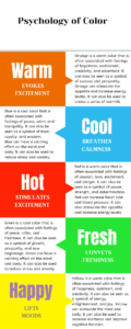
Warm Colors: Igniting Excitement and Appetite
It is well known that warm hues like red, orange, and yellow can arouse feelings of energy, excitement, and even hunger. Think about fast-food restaurants using red and yellow – it’s no coincidence! These colors stimulate appetite and create a sense of urgency. However, recent research suggests that overusing bright reds can also be perceived as aggressive. A more nuanced approach might involve incorporating softer oranges or yellows to create a welcoming, energetic vibe.
Cool Colors: Building Trust and Tranquility
Calm, relaxation, and trust are linked to cool hues like blue, green, and purple. Financial institutions frequently use blue because it conveys a sense of security and stability. Green, on the other hand, connects with nature and can be used to promote eco-friendly products or services. Interestingly, studies have shown that younger demographics, including infants, tend to prefer cooler hues, suggesting a potential shift in color preferences over a lifetime.
Color Combinations: Creating Dynamic Effects
Combining colors can create unique psychological effects. Red and yellow together create a sense of urgency, often used in sales signage. However, according to the Interdisciplinary Journal of Signage and Wayfinding (2024), effective color combinations should also consider cultural context and user demographics.
Brightness: Finding the Right Balance
Bright colors grab attention but can also be overwhelming. Moderation is key, especially with illuminated signs. Subtle variations in brightness can make a significant difference in how your sign is perceived. For instance, a softly lit blue sign can create a calming atmosphere, while a brightly lit blue might feel too intense. Especially important when using backlit or led illuminated channel letters signs.
Looking for “signage design near me?” Our staff is prepared to assist you with any task, including business signage design and digital signage design. Thinking about adding channel letters or commercial signage? Explore our Lobby Sign Service for inspiration tailored to your business.
Cultural Nuances: Respecting Global Perspectives
Color meanings vary across cultures. In certain Asian cultures, red can be connected to celebration or good fortune, but in Western cultures, it represents passion and love. Being mindful of these cultural nuances is essential for creating signage that resonates with diverse audiences. For example, white, often associated with purity in the West, can represent mourning in some Eastern cultures. This highlights the importance of research and understanding your target audience when using color in signage.
By understanding the psychology of color and applying these principles thoughtfully, you can create signage that not only attracts attention but also communicates the right message and strengthens your brand identity.

How to Influence Customer Spending?
Beyond merely being a visual component, color is a potent psychological tool that has a big influence on consumer behavior, including spending patterns. By understanding the subtle messages conveyed by different colors, businesses can strategically use them in their marketing, branding, and even interior design to create the desired customer experience and boost sales. Let’s explore how different colors can influence spending and which businesses can benefit most:
Red: The Impulse Driver
Red grabs attention, creates urgency, and encourages impulse buys. It’s no surprise that fast-food chains and retailers often use red in their branding and signage. Consider clearance sales signs, where the vivid red is intended to elicit quick action. However, the cultural context matters. While red signifies excitement in the West, it can also represent good luck and prosperity in some Eastern cultures, further enhancing its positive impact on spending.
Yellow: The Happiness Booster (Use with Caution!)
Yellow evokes happiness and energy, making it a popular choice for toy stores, children’s hospitals, and even some food outlets. However, be mindful of overuse, as excessive yellow can induce anxiety. Its attention-grabbing qualities also make it effective for service-based businesses like taxis or construction companies.
Orange: The Playful Persuader
Orange is a lively and striking color because it blends the vitality of red and the happiness of yellow. It’s often used by brands targeting younger demographics or those promoting adventurous experiences, from toy stores to travel agencies. Orange can also signal affordability and accessibility, making it a good choice for budget-friendly retailers or financial services.
Blue: The Trust Builder
Blue instills trust, calmness, and security. This makes it a favorite for financial institutions, healthcare providers, and tech companies. Blue conveys reliability and dependability, encouraging customers to feel confident in their purchasing decisions.
Black: The Symbol of Sophistication
Black represents luxury, sophistication, and exclusivity. Luxury brands, high-end retailers, and professional services often use black to create a sense of prestige and elegance. Black must be used carefully, though, as too much of it can be overwhelming.
Metallic Accents: Elevating the Brand
- Brass: This warm, golden alloy adds a touch of luxury and elegance, making it perfect for high-end furniture stores, hotels, or restaurants. Brass conveys tradition and quality, appealing to discerning customers.
- Gold: Gold symbolizes prestige, wealth, and success. Luxury brands, financial institutions, and high-end retailers use gold to create a sense of exclusivity and timeless appeal.
- Silver/Stainless Steel: Silver represents modernity, innovation, and sleek sophistication. It’s often used by technology companies, automotive brands, and luxury goods retailers to project a cutting-edge image.
Strategic Color Application: Maximizing Impact
By strategically using color in your signage, marketing materials, and even interior decor, you can create a powerful influence on customer perception and drive sales. Consider your target audience, brand message, and the specific emotions you want to evoke. Color, when used effectively, can be a game-changer for your business. From vibrant dimensional letters to sleek law firm signage, discover how to make your signs shine. Explore Dimensional Signs for ideas that grab attention.
Eye-Catching Signage: How to Pick Fonts and Sizes That Work
Your signage is like a silent salesperson, working 24/7 to attract customers. But if it’s hard to read, that salesperson isn’t doing its job! Let’s make sure your message is loud and clear with these tips on selecting the perfect fonts and sizes:
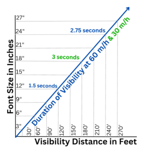
Size Matters: The Readability Rule
The “1 inch per 10 feet” rule is a useful guideline – raise your letter height by 1 inch for every 10 feet of viewing distance. Think about it: a tiny font on a roadside billboard is useless! At 30 mph, 24-inch letters give drivers roughly 5.5 seconds of reading time – just enough to catch your message.
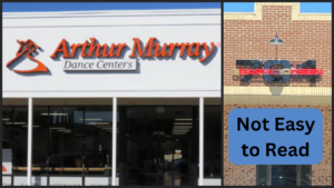
Font Selection: Keeping it Clear and Professional
- For large outdoor signs, sans-serif fonts like Arial and Helvetica are your best option. From a distance, their crisp lines are easy to read.
- Serif fonts like Times New Roman can work well for smaller signs where viewers are closer. The small “feet” on the letters can actually improve readability at close range.
- Bold fonts are great for highlighting key phrases or calls to action, making them stand out.
- Avoid decorative or script fonts like Comic Sans or grunge fonts. They might look stylish, but they’re often difficult to read, especially from afar. Prioritize clarity over artistic flair.
Recent research confirms that sans-serif fonts like Helvetica and Arial significantly improve readability, especially for larger signs viewed from a distance or in high-traffic areas. This is crucial for effective communication in fast-paced environments.
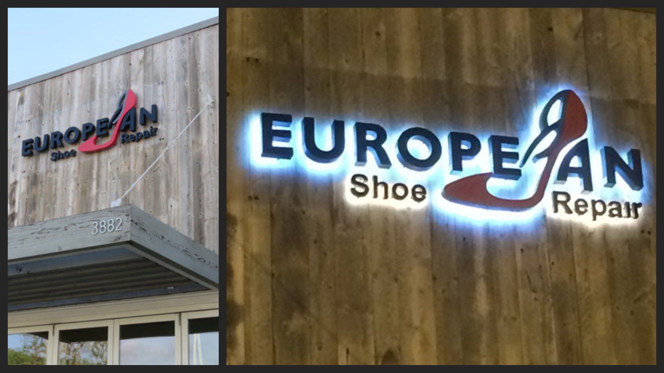
Color Contrast: Making Your Message Pop
High contrast is crucial. Dark letters on a light background (or vice versa) are easiest to read. Imagine trying to read light gray text on a white background – a recipe for eye strain!
The International Sign Association emphasizes font contrast as a critical factor for visibility. Ensure sufficient contrast between text and background, particularly for outdoor signs under varying lighting conditions. This ensures your message remains clear and legible throughout the day.
Placement and Lighting: Optimizing Visibility
Consider where your sign will be placed and how it will be lit. A sign in a dimly lit area might need larger, bolder text or even backlighting. A sign in direct sunlight might benefit from a non-glare finish. By following these simple guidelines, you can ensure your signage is not only attractive but also effective in communicating your message and attracting customers.
Ready to add easy-to-read color that pops for better foot traffic and increased sales? Check out our Wall and Window Graphics for bold, colorful and privacy ideas.

Designing Inclusive Signage: Accessibility Made Easy
Imagine a world where everyone feels welcomed and included — even before they walk in. Effective signage communicates clearly to everyone. Let’s explore how to create signage that is not only visually appealing but also accessible to people with disabilities:
User Involvement: A Key Ingredient for Success
Recent studies highlight the importance of involving people with disabilities in the design process. Their lived experiences provide invaluable insights, ensuring your signage meets their specific needs and expectations. This collaborative approach leads to more effective and truly inclusive designs.
This aligns with stakeholder theory, which emphasizes the importance of considering the needs of all stakeholders, including people with disabilities. Qualitative research methods, such as user interviews and focus groups, can provide valuable insights into user preferences and challenges, allowing for data-driven design decisions.
Evidence-Based Design Principles: Enhancing Accessibility
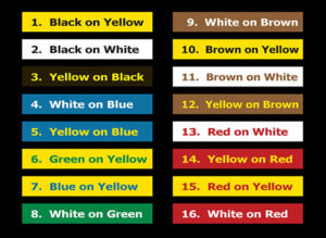
- Contrast is King: Use high contrast between text and background. For example, black text on a white background or yellow text on a black background.
- Glare Reduction: Opt for non-glare finishes, especially for outdoor signs. Glare can make it difficult for people with low vision or light sensitivity to read the sign.
- Font Selection: Choose clear, easy-to-read fonts like sans-serif typefaces (Arial, Helvetica). Avoid overly decorative or script fonts.
- Simplified Content: Keep it concise and to the point. Use simple language and avoid jargon.
- Symbols and Pictograms: Use symbols and pictograms to enhance understanding and communicate quickly. Ensure these are universally recognized and culturally appropriate.
ADA Compliance: Meeting and Exceeding Standards
The Americans with Disabilities Act (ADA) provides guidelines for accessible signage. Ensure your signage meets these requirements, including:
- Braille and Tactile Letters: Incorporate Braille and raised tactile letters for people with visual impairments. Recent advancements in ADA standards emphasize more detailed tactile elements and clearer Braille guidelines.
- Placement and Mounting Height: Signs should be placed at appropriate heights and locations for easy access and visibility.
- Clear Floor Space: Ensure there’s enough clear floor space in front of signs for wheelchair users.
Beyond ADA Compliance: A Holistic Approach
Accessibility goes beyond simply checking boxes. Consult with accessibility experts and engage with disability communities throughout the design process. This inclusive approach ensures your signage is not only ADA-compliant but truly user-friendly and welcoming to everyone.
ADA compliance is crucial. Ensure your signage adheres to the latest standards, including advancements in tactile elements and Braille specifications. Consider involving stakeholders in design and policy development for a truly inclusive outcome. This collaborative approach, supported by evidence-based design principles, helps create signage that is both compliant and genuinely user-friendly.
Make your business welcoming to all with ADA-compliant signage. Explore our ADA Sign Services and let’s create signs that include everyone.
Partnering for Accessible Design:
At Premium Sign Solutions, we’re passionate about creating inclusive environments. Our team can provide expert guidance on ADA compliance, material selection, and design best practices. Contact us today to learn how we can help you create signage that is both beautiful and accessible.

Eco-Friendly Signage Solutions to Enhance Your Brand
Sustainable design is no longer a trend; it’s a responsibility. Your signage can reflect your commitment to the environment while enhancing your brand image. Research on eco-friendly signage design highlights the benefits of using recycled or sustainable materials, low-energy LED lighting, and modular sign systems that reduce waste and allow for easy updates. This approach resonates with environmentally conscious consumers and positions your business as a leader in sustainability.
Show your customers you care about the planet and their values. Discover our street-side sustainable signage options to make an eco-friendly impact today.
Signage: Connecting Your Brand to the Community
Effective signage does more than just identify your business; it contributes to the character of the community. Well-designed signs can enhance local aesthetics, reinforce community identity, and create a sense of place. Studies have shown that cities that prioritize thoughtful signage integration enjoy stronger local businesses and a more vibrant public realm. Your signage becomes a visual representation of your brand’s values and its connection to the local community.
Ready to Transform Your Business with Stunning Signage?
Your signage is more than just a sign; it’s an investment in your brand’s future. It’s a powerful statement about your values, your commitment to your customers, and your contribution to the community.
By embracing evidence-based design methodologies, we can create signage that is not only visually appealing but also highly effective in guiding users, enhancing their experience, and strengthening your brand message.
When thoughtfully designed, your signage becomes a dynamic part of your brand story, creating a memorable and engaging experience for everyone who interacts with your business. It’s the silent ambassador of your brand, communicating your message 24/7.
Partner with Premium Sign Solutions
Ready to transform your brand presence in Southern California’s most vibrant and upscale communities? Premium Sign Solutions is here to help you craft signage that captures attention, enhances your brand image, and leaves a lasting impression.
Click to Get Your Free Custom Sign Design Quote Today!
Click here to schedule a free consultation. Let us help you bring your brand story to life.
Let Us Help You With A Free Custom Sign Design Quote Today
References:
- The effect of colour and density on the store perception
- The Psychology of Color’, Psychologist World,
- How On-Premise Signs Help Small Business Tap Into a Hidden Profit Center Handbook
- Color Psychology Used in Marketing
- Color Psychology: How Colors Influence the Mind
- The Power of Color
- Color Psychology: How Colors Influence the Mind