How Modern Hospital Wayfinding Solutions Transform Patient Experience
By Chris O’Connell, Premium Sign Solutions
21 November 2025
Designing Calm in a Complex Environment
Studies document that hospital staff spend 30 minutes weekly per person on wayfinding assistance, costing U.S. hospitals $12 billion annually in productivity losses. That is lost productivity. In 2025, signage isn’t just decoration; it’s an operational asset. Hospitals are some of the most emotionally and architecturally complex spaces people ever enter. Patients are arriving in pain, under stress, or worried about loved ones. Families are navigating unfamiliar corridors. Staff are trying to maintain efficiency in constantly shifting environments.
In the middle of all this is signage. Underestimated. Overlooked. But absolutely vital.
Clear, modern hospital signage reduces anxiety, improves flow, supports oaccessibility, and shapes perceptions of care long before a patient ever meets a doctor.
In this white paper, we explore the major trends shaping hospital signage in 2025, based on real installation experience, emerging design research, and insights from our AMA video series with owner Chris O’Connell.
If you’re a hospital administrator, facilities manager, architect, or healthcare design team, this guide will help you understand:
- What’s driving signage upgrades nationwide
- How design impacts patient psychology
- What’s trending now and what will matter in 2025
- The ROI behind modern wayfinding and digital signage
- How to future-proof systems as departments evolve.
Let’s look into this in detail.
WAYFINDING & NAVIGATION – Designing Predictability Into Care
Just consider with a 500-bed hospital losing over $4 million annually. Increased length of stay accounts for 53% of this economic burden, while nearly 44% of staff experience incivility from frustrated facility users.
The Science of Stress Reduction Through Signage
When a visitor enters a hospital, the very first questions their brain asks are:
“Where am I?
Where do I go?
How long will it take to get there?”
Every question without an immediate answer triggers anxiety.
As Chris says in the AMA:
“Clear signage removes uncertainty. Predictability creates calm.”
Chris O’Connel
Hospitals that invest in modern wayfinding systems report:
- Lower patient stress
- Fewer staff interruptions for directions
- Faster visitor movement
- Better ADA compliance
Good signage = lower cognitive load.
And in a medical environment, cognitive load matters.
What Makes Hospital Wayfinding Feel Effortless?
One word:
Consistency.
Effortless navigation happens when:
- Typography is standardized
- Arrows follow the same logic everywhere
- Departments use consistent naming conventions
- Colors signal zones or floors
- Icons are intuitive and repeatedly used
A patient should learn the “rules” of your signage in the lobby and rely on those rules all the way to Radiology.
This is why modern hospitals now design full campus-wide visual systems, not isolated signs.
What to Ask Your Signage Partner
- Do we have color-coded pathways?
- Are icons and typography consistent across all buildings?
- Is the naming convention unified?
- Can we update signs quickly when departments move?
Most hospitals can’t answer “yes” to all four – and that’s exactly where modern wayfinding begins.
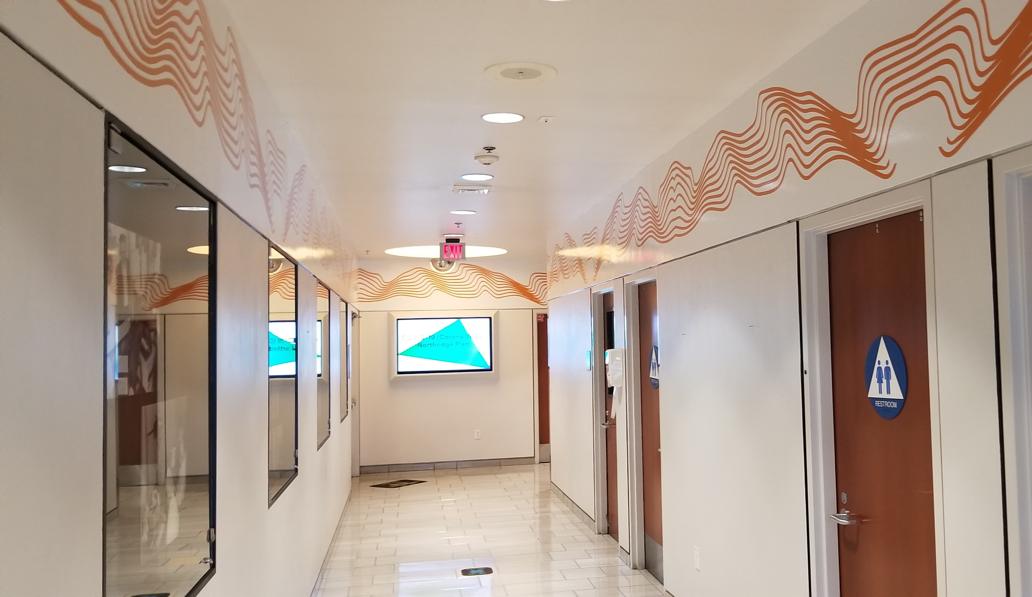
DIGITAL & INTERACTIVE SIGNAGE – Real-Time Communication for Dynamic Environments
Imagine the ease of updating as doctors schedule changes due to emergicies. This directly translates to happier patients as they feel included in the communications rather than in the dark waiting for answers.
Are Digital Directories Improving Hospital Navigation?
Short answer: Yes.
Long answer: Yes – when used intentionally.
Digital signage solves the #1 frustration in hospital navigation:
Information changes constantly.
- Departments move.
- Construction zones shift.
- Visiting hours adjust.
- Providers rotate.
- Traditional signs take months to update.
- Digital directories update in seconds.
- This alone can dramatically improve the patient experience.
Using Digital Signage Without Overwhelming Visitors
Chris explains it perfectly:
“A digital sign should behave like a sign – clear, stable, and focused.”
Chris O’Connell
The biggest mistakes hospitals make:
- Too much animation
- Too many menus
- Colors that compete instead of guide
- Treating digital screens like websites
Best practice:
- Large touch targets
- Minimal motion
- Fixed layout zones
- Real-time updates only where it matters
Digital is powerful – but clarity always wins.
ACCESSIBILITY & INCLUSIVITY – Designing for Every Patient
Your visitors are diverse and including their needs in every facility decision is vital. Wether we catering for sight impairment or access for wheels, thoughtful planning reduces compliance headaches.
The Hidden Problems In ADA Compliance
Here’s what most hospitals get wrong:
❌ Incorrect color contrast
❌ Braille placed too low or too high
❌ Tactile letters that fail spacing requirements
❌ Materials that look good but aren’t readable
As Chris puts it:
“True accessibility is precision, not box-checking.”
Chris O’Connell
Patients with low vision, cognitive differences, or language barriers rely on signage more than anyone else. When hospitals cut corners, they unintentionally harm the people who need clarity most.
The Power of Multilingual Hospital Signage
In diverse regions, multilingual signage is no longer optional.
When people see information in their language:
- Trust increases
- Anxiety drops
- Instructions are followed more accurately
- The facility feels safer and more welcoming
Hospitals in LA, New York, Texas, and Chicago are now adopting bilingual or trilingual signs as standard.
This is a trend that will grow significantly in 2025.
Inclusive Design Checklist
- High-contrast compliant color pairings
- Braille placed at proper height
- Tactile letters with correct stroke width
- Multilingual layouts designed with equal hierarchy
- Modular sign frames that allow for updates
Think of this section as the minimum baseline for 2025 healthcare signage.
BRANDING & EMOTIONAL DESIGN – How Signage Shapes Perception of Care
Patients Judge the Quality of Care Before Meeting a Doctor
This is more than theory – it’s proven in healthcare design studies.
Before a patient interacts with staff, they subconsciously evaluate:
- Cleanliness
- Order
- Professionalism
- Modernity
Signage is one of the first visual cues they see.
Chris frames it perfectly:
“Clean, modern signage communicates competence.”
Chris O’Connell
A cluttered sign or outdated design silently communicates:
- Disorganization
- Low investment
- Poor quality
Hospital branding is patient experience.
Aligning Signage With Hospital Identity
Hospitals now borrow from hospitality design:
- Warm woods
- Soft lighting
- Natural color palettes
- Subtle metal finishes
- Calming fonts
Signage is part of that emotional environment.
When your brand is consistent across:
- Website
- Staff uniforms
- Lobby signage
- Floor directories
- Department plaques
…the entire patient experience feels trustworthy and intentional.
SUSTAINABILITY & FUTURE-PROOFING – The Next Era of Healthcare Signage
Regulation are driving change and community appreciate the shift.
Why Eco-Friendly Materials Matter Now More Than Ever
Hospitals are under pressure from:
- LEED requirement
- Environmental policies
- Sustainability scoring
- Community expectations
The industry is shifting toward:
- Recycled aluminum
- Low-VOC paints
- Eco-friendly laminates
- Fabrication processes with reduced waste
This is more than a trend – it’s a structural shift.
The Modular Signage Revolution
- Hospitals change. Constantly.
- Doctors rotate.
- Departments move.
- Regulations evolve.
- New treatments come online.
- Traditional signage becomes obsolete quickly.
Modular signage solves this.
Panels slide out instead of needing refabrication.
Frames stay mounted for years.
Updates take minutes, not weeks.
This is one of the biggest ROI shifts in hospital design for 2025.
CASE STUDY SNAPSHOTS: Real-World Application
LA ENT – Channel Letters for Medical Visibility
How lighting and clarity shape patient arrival.
Coalition for Family Harmony – Lobby Sign for Professional Identity
How branding affects perceived trust.
Advisor Associates – Architectural Interior Signage
How clean typography reduces cognitive load.
These examples reinforce the core message:
Better signage means better patient experience.
THE FUTURE OF HEALING SPACES
Hospital signage is rapidly evolving from “labels on walls” into a fully integrated component of modern healthcare design.
The next generation of signage is:
- Clearer
- More accessible
- More sustainable
- More modular
- More patient-centered
- More aligned with digital infrastructure
Hospitals that invest today will set a new standard of calm, clarity, and trust for the next decade.
Ready to Upgrade Your Hospital’s Signage System?
Whether you’re refreshing a single department or redesigning an entire campus, we can help you create a modern signage system that improves navigation, accessibility, patient trust, and long-term efficiency.
Start your healthcare signage project with Premium Sign Solutions.