What details should an apartment building sign have? And what should be left off?
In a city filled with towering buildings, how can your apartment complex stand out? Can an ordinary building feel like a home, comforting your every step? The answer often lies in well-crafted apartment signage that blends form, function, and compliance. Apartment building signs aren’t just labels; they’re tools for branding, wayfinding, and creating a professional image. Modern designs can even reflect the building’s personality, whether it’s sleek and minimalist or vibrant and welcoming.
In this article, we’ll look at apartment building signs, unveiling their vital role in urban living. We’ll explore the key elements that make a sign effective and memorable, offering solutions to common pitfalls. Whether you’re a property manager seeking to make your building stand out or a curious reader interested in the art of signage, this article will shed light on the significance of these unassuming markers in the urban jungle. So which details must a well-crafted sign have to transform an ordinary building into an extraordinary home?
What details should an apartment building sign have?
What makes a sign compliant and effective? Apartment signage must meet legal requirements while being visible, functional, and reflective of the building’s identity.

The Essential Elements of an Apartment Sign
Details
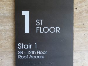
The details of an apartment building sign should include the name and logo of the building, the address and contact information, and any special features or offers that the building provides. These details should be clear and concise, and communicate the message and identity of the building to the target audience. So why would these be important you may wonder. It’s helpful for new residents to find your building, for traffic to know where they are and services understand the dynamics of your location.
Placement
So you may wonder what is ideal placement of my signage? The placement of an apartment building sign should be in a spot that is visible from different angles and distances, and that does not interfere with other signs or structures. For example, a sign on a building should avoid areas where trees or other buildings can block the view. A sign should also be at eye level or above for pedestrians and drivers, so that they can easily see and read it.
Size
The size of an apartment building sign should be large enough to be readable from the intended viewing distance, but not too large that it overwhelms the space or violates the city regulations. The size of the sign depends on the viewing distance, the number of characters and spaces, and the sign width. There are some formulas and guidelines that can help determine the optimal size of a sign, such as the rule of thumb that one inch of letter height equals 25 feet of viewing distance.
Shape
The shape of an apartment building sign should suit the content and the style of the sign, and create visual interest and harmony. For example, a circular sign may convey friendliness or inclusiveness, while a rectangular sign may suggest stability or professionalism. A sign can also have a custom shape that reflects the logo or the theme of the building.
Color
The color of an apartment building sign should match the brand image and the environment, and evoke the desired emotion or association from the audience. For example, a bright color may stand out in a dull setting, while a dark color may blend in with a vibrant background. The color should also contrast well with the text and the background, so that they are easy to read and distinguish.
Fonts
The fonts of an apartment building sign should be easy to read and understand, such as sans serif fonts or simple symbols. The fonts should also match the tone and personality of the building, such as modern or classic, formal or casual.
Graphics
The graphics of an apartment building sign are any images or symbols that complement or enhance the text. Graphics can help attract attention, illustrate features, or create associations. For example, a graphic of a pool can indicate that the building has a swimming facility, or a graphic of a leaf can suggest that the building is eco-friendly.
We have a great resources on signage design principles and best sign visibility colors for further exploration.
The optional elements of a sign
Optional elements play a crucial role in enhancing the appeal and impact of an apartment building sign. By incorporating branding, symbols, slogans, QR codes, and other creative features, these signs can effectively communicate the message and identity of the building.
Branding
Branding elements on a sign include the use of a building’s logo, color scheme, and typography consistent with the building’s marketing materials. This consistency helps reinforce the brand image and recognition.
Symbols
Symbols serve as visual shorthand, conveying complex messages with just a simple image. For instance, a key symbol may indicate secure living, while a heart may suggest a welcoming community.
Slogans
A catchy slogan can be a powerful tool. For instance, “Your Home, Your Sanctuary” not only communicates a sense of safety but also creates an emotional connection.
QR Codes
QR codes, when scanned, can provide instant access to additional information or services. For instance, a QR code might lead to a virtual tour of the building or a link to an application form.
Creative usage of these elements can be seen in various signs. For instance, a luxury apartment building might use a combination of sleek branding elements like a silver logo and minimalist fonts to convey a sense of sophistication. A slogan like “Elevate Your Living” emphasizes the aspirational lifestyle offered. Additionally, a QR code on the sign allows interested individuals to explore floor plans and amenities through their smartphones.
In contrast, a more eco-friendly apartment might use symbols like leaves and recycling icons, paired with a warm color scheme and an inviting slogan like “Join Our Green Community.” A QR code could lead to information about the building’s sustainability efforts.
By creatively incorporating these optional elements into apartment building signs, property managers can effectively communicate the unique message and identity of the building, appealing to their target audience and leaving a lasting impression. These features transform signs from simple identifiers into powerful marketing tools, providing a glimpse of what a future resident can expect and enticing them to explore further.

What details should be left off an apartment building sign?
The common mistakes to avoid
Avoiding common mistakes on apartment building signs is essential to maintain their effectiveness and attractiveness. Mistakes like clutter, confusion, inconsistency, and illegibility can significantly harm the impression and reputation of the apartment building.
Clutter
Cluttered signs overwhelm viewers and make it challenging to extract essential information. When signs are crowded with excessive details, images, or text, they can become visually chaotic.
Confusion
Signs should be clear and concise. Confusing elements, such as contradictory information or a lack of structure, can lead to misunderstandings or frustration for viewers.
Inconsistency
Inconsistent branding, fonts, and design choices across various signs can create a disjointed and unprofessional image for the apartment building.
Illegibility
Sign text must be easy to read, even from a distance. Poor font choices, inadequate contrast between text and background, or small lettering can result in illegible signs.
Examples of signs that make these mistakes can be found in various settings. For instance, a cluttered sign with a jumble of logos, text, and symbols may be challenging to decipher, leaving viewers with a sense of confusion. Signs that display inconsistent branding elements, such as mismatched colors and fonts, may appear unprofessional and disorganized, detracting from the building’s image.
Illegible signs, with tiny text or inadequate color contrast, can be frustrating for anyone trying to obtain information quickly. These mistakes can create a negative impression of the building and suggest a lack of attention to detail and professionalism.
In summary, overlooking these common mistakes on apartment building signs can have detrimental consequences for the building’s reputation. Such signs should be designed with careful consideration to avoid clutter, confusion, inconsistency, and illegibility. By doing so, property managers can present a clear, professional, and visually appealing image, leaving a positive and lasting impression on potential residents and visitors.

The legal and safety standards to follow
Adhering to legal and safety standards is paramount when designing apartment building signs. These regulations cover aspects such as size, location, lighting, content, and more. Their purpose is to ensure the safety and harmony of the community.
Size and Location
Local ordinances often dictate the maximum size of signs and their placement. These rules prevent excessively large, obstructive signs that could pose safety hazards, like obstructing views for drivers or pedestrians.
Lighting
Many areas have guidelines concerning sign lighting. This is vital for visibility, especially at night, and to avoid excessive light pollution, which can disrupt the surrounding environment.
Content
Regulations often address content, such as prohibiting offensive or misleading information. This helps maintain a respectful and honest environment.
Compliance with these standards is essential to maintain community safety and harmony. For instance, in a busy urban neighborhood, strict size regulations prevent large signs that could distract drivers, causing accidents. Properly lit signs enhance visibility and reduce the likelihood of pedestrians stumbling in dimly lit areas.
Examples of signs that comply with these standards can be found in urban areas. Signs in compliance maintain a harmonious streetscape. They are proportionate to the building size, well-lit for clear readability, and display appropriate content. These signs contribute to the overall safety and visual appeal of the community.
In summary, legal and safety standards for apartment building signs play a vital role in ensuring the safety and harmony of a community. By adhering to these regulations, property managers help maintain an aesthetically pleasing environment while preventing potential hazards. Examples of well-compliant signs can be observed in various communities where strict adherence to these standards is the norm, creating a balanced and secure urban landscape.
Let Us Elevate Your Signage
In a nutshell, crafting an effective apartment building sign is more than a mere label; it’s a powerful tool for communicating identity and attracting residents. We’ve explored the critical elements like branding, symbols, and slogans that can enhance the sign’s appeal and impact, setting the stage for a memorable first impression.
To excel in the realm of apartment building signs, here are some recommendations:
- Consistency is Key: Maintain consistency in branding elements, fonts, and colors. This reinforces the building’s identity.
- Simplicity Sells: Keep it simple and avoid clutter. Clear, concise signs are more likely to leave a positive mark.
- Legal Compliance: Always adhere to local regulations regarding sign size, lighting, and content to ensure community harmony and safety.
- Lighting Matters: Invest in well-thought-out lighting for better visibility, especially during the dark hours.
- Quality Materials: Use durable materials that can withstand weather and wear, ensuring longevity.
As we conclude, here’s a question to ponder: How can you use the art of signage to shape the image of your apartment building, making it an attractive and welcoming home for future residents? Start the journey towards creating the perfect apartment building sign that leaves a lasting impression.